[01]
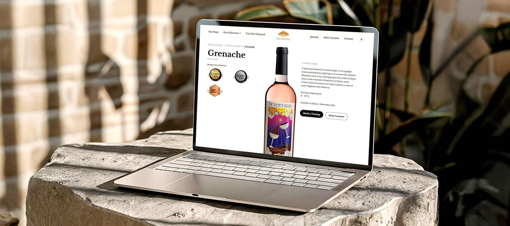
Outdated design, no collection identity
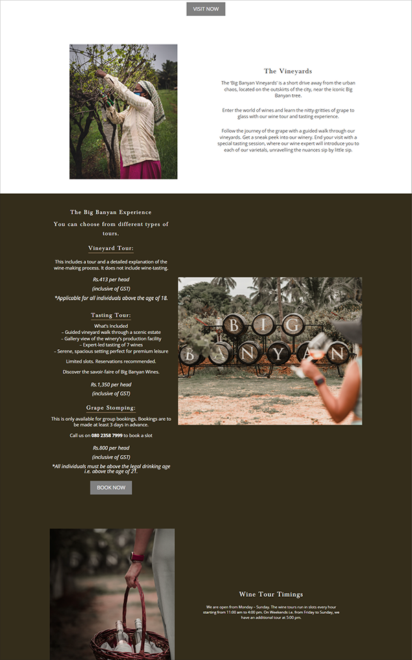
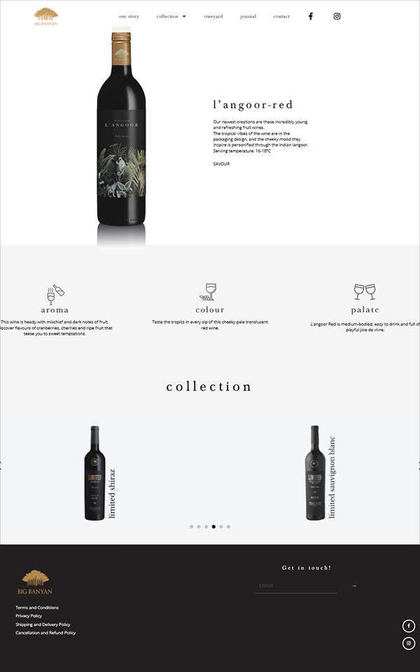
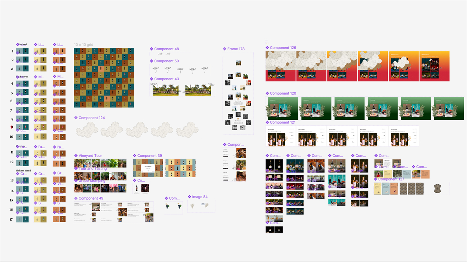
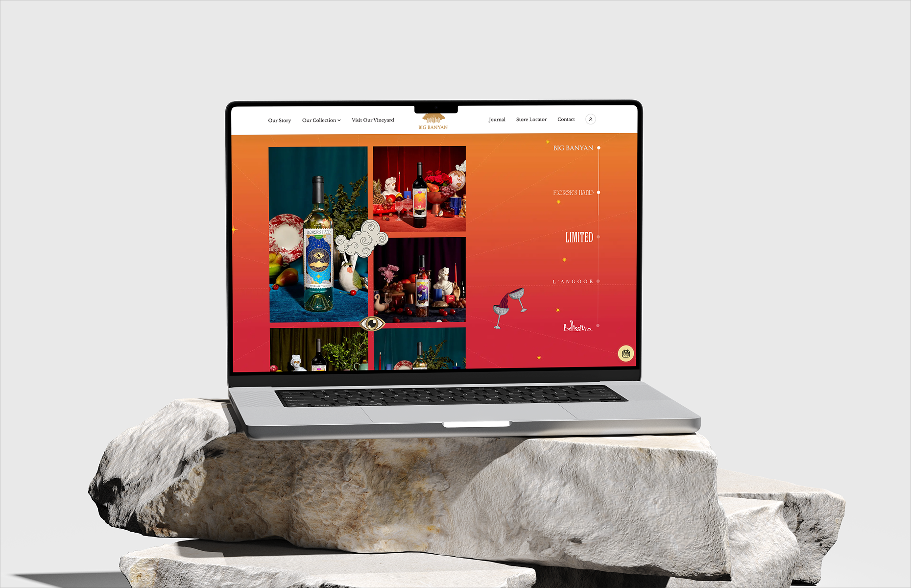
Every wine collection shared the same plain layout - white background, flat bottle image, no personality. Picker's Hand has tarot-card-inspired labels. L'angoor targets younger drinkers with playful monkey illustrations. Limited uses dark, premium aesthetics. None of this came through on the website.